Trình hiển thị động Dot Momentum %BB cho cTrader
Định lượng Biến động. Hiển thị Động lượng. Làm chủ các điểm vào lệnh của bạn.
Khai thác sức mạnh của biến động với Trình hiển thị động Bollinger Bands %B, một chỉ báo tùy chỉnh độc đáo cho cTrader được thiết kế để cung cấp cho bạn cái nhìn sâu sắc chưa từng có về hành động giá so với phong bì biến động của nó. Vượt ra ngoài Bollinger Bands truyền thống, chỉ báo này biến các chỉ số biến động phức tạp thành một dòng các vòng tròn mã màu trực quan, giúp bạn xác định các điểm xoay quan trọng của thị trường và sức mạnh xu hướng.
Bollinger Bands %B là gì và nó khác biệt như thế nào?
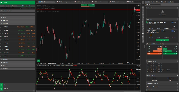
Trong khi Bollinger Bands tiêu chuẩn được phủ trực tiếp lên biểu đồ giá của bạn, hiển thị hỗ trợ/kháng cự động và thể hiện trực quan biến động thị trường thông qua sự mở rộng và co lại của chúng, thì Bollinger Bands %B là một bộ dao động. Nó được hiển thị trong một bảng riêng bên dưới biểu đồ chính của bạn, cung cấp một đo lường định lượng vị trí hiện tại của giá bên trong phong bì Bollinger Bands.
Nó không hiển thị giá trực tiếp; thay vào đó, nó tiết lộ vị trí tương đối của giá trên thang đo từ 0 đến 1:
- 0.0: Giá ở dải Bollinger dưới.
- 0.5: Giá ở dải Bollinger giữa (Đường trung bình động).
- 1.0: Giá ở dải Bollinger trên.
Lợi ích & Bối cảnh Biến động:
Chỉ báo này không chỉ quan sát đơn thuần. Nó định lượng vị trí giá so với biến động vốn có của nó, cho phép bạn:
- Đánh giá sức mạnh xu hướng: %B duy trì trên 0.5 cho thấy động lượng tăng mạnh, trong khi dưới 0.5 biểu thị áp lực giảm.
- Xác định khả năng đảo chiều: Các giá trị cực đoan (gần 0.0 hoặc 1.0) có thể báo hiệu giá đang bị kéo căng quá mức trong phạm vi biến động hiện tại.
- Hiểu bối cảnh biến động: Biến động bản thân nó (được thể hiện qua độ rộng của Bollinger Bands cơ sở) luôn có bối cảnh theo khung thời gian bạn đang xem. Một giá trị %B trên biểu đồ 1 giờ phản ánh biến động khác với biểu đồ 1 ngày. Chỉ báo của chúng tôi thích ứng liền mạch với khung thời gian bạn chọn, cung cấp những hiểu biết phù hợp.
Tính năng kỹ thuật:
- Tính toán chính xác: %B được tính theo công thức: (Giá hiện tại−Dải dưới)/(Dải trên−Dải dưới)
- Mã màu động (vòng tròn):
-
- Vòng tròn xanh chanh: Biểu thị giá trị %B đang tăng so với thanh trước, báo hiệu động lượng tăng.
- Vòng tròn đỏ: Biểu thị giá trị %B đang giảm so với thanh trước, báo hiệu động lượng giảm.
- Vòng tròn bạc: Hiển thị khi giá trị %B không đổi hoặc tại điểm hợp lệ đầu tiên.
- Đường dẫn tinh tế: Một đường mảnh màu xám nhạt nhẹ nhàng theo dõi đường đi tổng thể của giá trị %B, cung cấp sự liên tục trực quan dưới các vòng tròn động.
- Các dấu mốc mức độ kín đáo: Các đường màu xám đậm, liền nét tại 0.0, 0.5 và 1.0 (dễ nhìn thấy mà không làm lu mờ hình ảnh chính) cung cấp các điểm tham chiếu rõ ràng cho các mức biến động cực đoan và trung bình.
- Tùy chỉnh được: Điều chỉnh chu kỳ Bollinger Bands, độ lệch chuẩn và loại MA trực tiếp từ cài đặt.
Giải thích đơn giản: Tín hiệu quá biến động (Giống như RSI cho biến động!)
Hãy nghĩ về chỉ báo này như một RSI, nhưng dành cho việc kéo căng quá mức biến động thay vì các mức giá quá mua/quá bán đơn giản.
- Khi các vòng tròn chạm hoặc đi xuống dưới 0.0, điều đó có nghĩa là giá đang đẩy mạnh về phía đáy của phong bì biến động hiện tại. Đây giống như một tín hiệu "biến động quá bán", gợi ý thị trường có thể đang bị kéo căng quá mức về phía giảm trong bối cảnh hiện tại.
- Khi các vòng tròn chạm hoặc vượt lên trên 1.0, điều đó có nghĩa là giá đang đẩy mạnh về phía đỉnh của phong bì biến động hiện tại. Đây giống như một tín hiệu "biến động quá mua", gợi ý thị trường có thể đang bị kéo căng quá mức về phía tăng trong bối cảnh hiện tại.
Những giá trị cực đoan này không nhất thiết có nghĩa là "mua" hoặc "bán" ngay lập tức, nhưng chúng là cảnh báo mạnh mẽ rằng thị trường đang ở điểm cực đoan trong phạm vi di chuyển điển hình của nó cho khung thời gian cụ thể đó. Điều này thường báo trước một sự hồi quy về trung bình tiềm năng hoặc sự thay đổi trong hành vi biến động của thị trường.
5 | 0 % | |
4 | 100 % | |
3 | 0 % | |
2 | 0 % | |
1 | 0 % |