Heikin Ashi Struktur-Bias (cTrader Indikator)
Automatische Angebots-Nachfrage-Zonen mit Multi-Timeframe-Bias.
Was es tut – in einfachem Deutsch
Dieser Indikator:
- Liest die Heikin Ashi Kursbewegung und erkennt bedeutende Pivot-Verschiebungen.
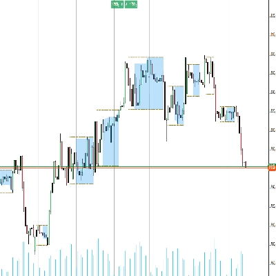
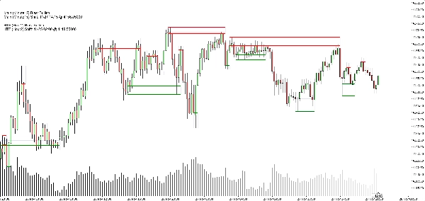
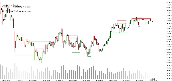
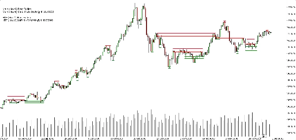
- Erstellt dynamische Unterstützungs- und Widerstandszonen um diese Pivot-Punkte herum, unter Verwendung sowohl des Docht-Extremes als auch des Kerzenkörpers (nicht nur zufällige Linien).
- Fasst nahegelegene Zonen intelligent zusammen, sodass Sie klare, handelbare Niveaus sehen, anstatt eines Waldes von horizontalen Linien.
- Erzeugt eine klare bullische oder bärische Tendenz, wann immer der Kurs die letzte Unterstützungs- oder Widerstandszone vollständig durchbricht.
- Zeigt Ihnen die Tendenz für:
-
- Ihren Chart-Zeitrahmen, und
- Einen optionalen höheren Zeitrahmen (Standard H2) — ohne HTF-Unordnung auf Ihrem Chart zu zeichnen.
Ergebnis: Ein Blick sagt Ihnen wo die echten Niveaus sind und ob der Markt gerade nach oben oder unten tendiert.
Das Problem, das es löst
Die meisten Trader haben dieselben Probleme:
- Von Hand gezeichnete Unterstützungs-/Widerstandslinien sind:
-
- subjektiv,
- inkonsistent,
- und oft übertrieben.
- Einfache „Zickzack + horizontale Linie“-Indikatoren:
-
- behandeln die Zonengröße nicht richtig,
- stapeln Niveaus übereinander,
- oder verlängern Zonen so weit, dass sie die Hälfte des Charts abdecken.
- Der Bias ist oft „im Kopf“ – nicht etwas, das man klar sehen oder regelbasiert nutzen kann.
Dieser Indikator ist gebaut, um:
- Die Heikin Ashi Struktur in klare, objektive Zonen zu verwandeln,
- Ihnen einen regelbasierten Trend/Bias basierend auf diesen Zonen zu geben,
- Während der Chart sauber und lesbar bleibt.
Wie die Zonen gebaut werden (traderfreundliche Erklärung)
Für jeden Heikin Ashi Pivot betrachtet der Indikator eine 3-Kerzen-Struktur:
- Wenn HA von rot zu grün wechselt, markiert es einen Unterstützungspivot.
- Wenn HA von grün zu rot wechselt, markiert es einen Widerstandspivot.
Dann baut es die Zone:
Unterstützungszonen
- Findet den niedrigsten Docht unter den 3 Kerzen (echtes Extrem).
- Findet das nächstniedrigste Tief, das immer noch höher als dieses Extrem ist.
- Verwendet den Kerzenkörper (Open/Close) nahe diesem inneren Tief, um die „handelbare“ Seite der Zone zu definieren.
- Endgültige Unterstützungszone:
-
- Unten = extrem niedriger Docht,
- Oben = körperbasiertes inneres Niveau.
Widerstandszonen
- Findet den höchsten Docht unter den 3 Kerzen.
- Findet das nächsthöchste Hoch, das immer noch niedriger als dieses Extrem ist.
- Verwendet den Körper nahe diesem inneren Hoch.
- Endgültige Widerstandszone:
-
- Oben = extrem hoher Docht,
- Unten = körperbasiertes inneres Niveau.
Jede Zone ist also nicht nur ein willkürlicher Bereich:
Es ist ein Docht-zu-Körper-Bereich, der darstellt, wo der Kurs wirklich abgelehnt oder umgekehrt hat.
Zusammenführungslogik (warum der Chart sauber bleibt)
Zonen desselben Typs (Unterstützung mit Unterstützung, Widerstand mit Widerstand):
- Werden als Einheiten auf einer Zeitachse behandelt.
- Können nur zusammengeführt werden, wenn sie tatsächlich im Preis überlappen.
- Das Zusammenführen ist strikt lokal:
-
- Eine neue Zone kann sich mit:
-
- der jüngsten Zone (direkt nebeneinander), oder
- der zweitjüngsten Zone (+1 Abstand), und
- einer zusätzlichen „Anker“-Zusammenführung dahinter, wenn die neue kombinierte Zone jetzt die vorherige Struktur überlappt.
Das hält das Verhalten intuitiv:
- Zonen „verschlingen“ nicht die gesamte Historie.
- Ältere Niveaus werden respektiert, dürfen aber keine riesigen Mega-Zonen erzeugen.
- Lokale Strukturen wie A–B–C oder A–C+D werden kontrolliert behandelt.
Bias-Logik (wie Sie tatsächlich damit handeln)
Für jeden Zeitrahmen (Haupt- und HTF):
- Verfolgt der Indikator die jüngste zusammengeführte Unterstützungszone und die jüngste zusammengeführte Widerstandszone.
- Dann, bei jeder geschlossenen Kerze:
-
- Wenn der Kurs über der jüngsten Widerstandszone schließt → wird der Bias bullisch.
- Wenn der Kurs unter der jüngsten Unterstützungszone schließt → wird der Bias bärisch.
Es speichert:
- Die Zeit der letzten Bias-Umkehr,
- Das Preisniveau, bei dem der Kurs die Zone durchbrochen hat.
Im Chart zeigt ein kleines Textfeld:
Haupt (H1) Bias: BullischHaupt (H1) Wechsel: 26.11. 15:00 @1.08750
Wenn HTF aktiviert ist, sehen Sie auch etwas wie:
HTF (H2) Bias: BärischHTF (H2) Wechsel: 25.11. 08:00 @1.09200
Sie können auch eine Sound-Benachrichtigung aktivieren, wenn der Bias des Hauptzeitrahmens wechselt.
Was Sie im Chart sehen
- Unterstützungszonen:
-
- Grüne horizontale Basis-/Triggerlinien (optional),
- Ein weiches marineblaues Rechteck (sehr geringe Deckkraft), das das gesamte Unterstützungsband zeigt.
- Widerstandszonen:
-
- Rote Linien + weiches marineblaues Rechteck für das Band.
- Saubere Anzeige-Umschalter:
-
- Unterstützungszonen ein-/ausblenden,
- Widerstandszonen ein-/ausblenden,
- Gefüllte Rechtecke ein-/ausschalten,
- Basis-/Triggerlinien ein-/ausschalten,
- Bias-Panel ein-/ausschalten.
Das ermöglicht verschiedenen Tradern die Wahl zwischen:
- Einem eher minimalistischen Look (vielleicht nur Rechtecke), oder
- Einer eher präzisen Ansicht (exakte Linien sichtbar).
Typische Anwendungsfälle
Sie können ihn als nützlich positionieren für:
- Trendfilterung
-
- Nur nach Käufen suchen, wenn sowohl Haupt-TF als auch HTF Bias bullisch sind.
- Nur nach Verkäufen suchen, wenn beide bärisch sind.
- Zoneneinstiege
-
- Verwenden Sie die Zonen als Interessensgebiete für:
-
- Limit-Orders,
- Bestätigungseinstiege (z.B. Kurs kehrt zu einer gebrochenen Zone zurück und lehnt erneut ab),
- Stop-Setzung knapp außerhalb des äußeren Bandes.
- Top-Down-Analyse
-
- HTF-Bias (standardmäßig H2) als Gesamtbild,
- Chart-TF-Bias für Timing,
- Zonen für konkrete Ausführungsebenen.
Was es NICHT ist (wichtig für ehrlichen Verkauf)
- Es ist kein Roboter, der automatisch für Sie handelt.
- Es ist kein „heiliger Gral“-Signal, das Gewinn garantiert.
- Es ist eine Struktur- und Bias-Engine:
-
- Definiert Zonen objektiv,
- Definiert Trend/Bias objektiv basierend auf diesen Zonen,
- Überlässt das eigentliche Trade-Management dem Trader/der Strategie.
5 | 33 % | |
4 | 67 % | |
3 | 0 % | |
2 | 0 % | |
1 | 0 % |