
설명
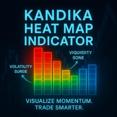
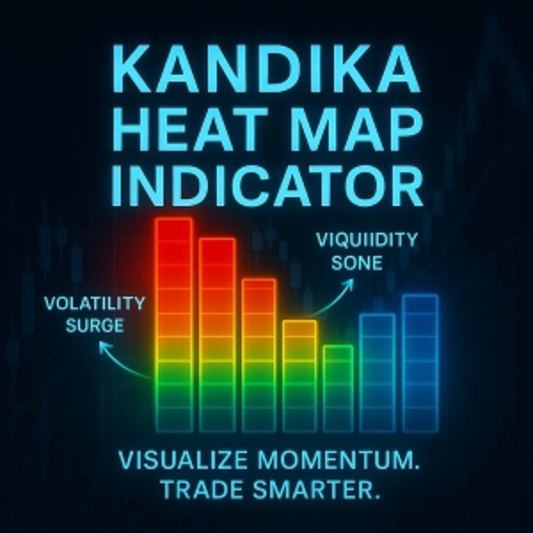
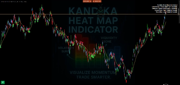
🎨 컬러 로직 – 그것이 알려주는 것
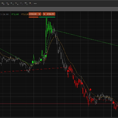
- 🟩 라임 그린 → 추세 상승 전환
강세 모멘텀 변화가 형성되고 있습니다. 이를 이용해 초기 상승을 포착하세요. - 🟥 크림슨 → 추세 하락 전환
하락 압력이 쌓이고 있음을 신호합니다. 잠재적 숏 포지션이나 청산에 대비하세요. - 🟧/🔴 오렌지/레드 → 고변동성 구역
가격 급등, 빠른 움직임, 잠재적 함정을 예상하세요. 무작정 추측할 곳이 아니므로 전략을 확인하세요. - 🟦 스틸 블루 → 저변동성 구역
시장이 둔화, 압축 또는 횡보 중입니다. 종종 돌파 기회를 준비합니다.
📊 기능 (그리고 하지 않는 것)
- ✅ 추세 방향 변화를 명확히 표시합니다
- ✅ 조용한 구역과 변동성 구역을 시각적으로 구분합니다
- ✅ 간단하고 차트 친화적인 오버레이—복잡하지 않음
요약
AI 요약
The Kandika Heat Map is a color-coded market indicator designed to visualize market pressure and volatility on trading charts. It uses distinct colors to represent different market conditions: lime green signals an upward trend shift indicating bullish momentum; crimson indicates a downward trend shift signaling bearish pressure; orange/red marks high volatility zones characterized by rapid price movements and potential traps; steel blue denotes low volatility zones where the market is consolidating or ranging, often preceding breakouts. This indicator clearly maps trend direction changes and visually separates calm from volatile market phases. It is presented as a simple, non-intrusive overlay that integrates smoothly with existing charts, aiding traders in identifying trend shifts and volatility levels without clutter.
지표 프로필
상담
고객 리뷰
4.6
리뷰: 5
5 | 60 % | |
4 | 40 % | |
3 | 0 % | |
2 | 0 % | |
1 | 0 % |
고객 리뷰
August 4, 2025
Good helper vibe, not a full system vibe, and A rushed entry can still spoil the trade.
August 4, 2025
No reason to yolo this live without a few normal sessions, and Bad settings can ruin the idea.
July 26, 2025
July 26, 2025
20 percent less clicking is the line to watch. Market checks feel quicker.
자주 묻는 질문(FAQ)
트레이딩 봇, 지표, 플러그인 등 cTrader Store에서 제공되는 상품은 제3자 개발자에 의해 제공되며, 이는 단순히 정보 및 기술적 접근을 목적으로 제공된 것입니다. cTrader Store는 중개인이 아니며, 투자 조언, 개인별 추천 또는 향후 성과에 대한 어떠한 보장도 제공하지 않습니다.





가격
가입일 08/06/2025
1
판매