
KANDIKA HEAT MAP
Indicador
1 compras
Versión 1.0, Jul 2025
Windows, Mac
4.6
Valoraciones: 5
Desde 08/06/2025
1
Ventas
Descripción
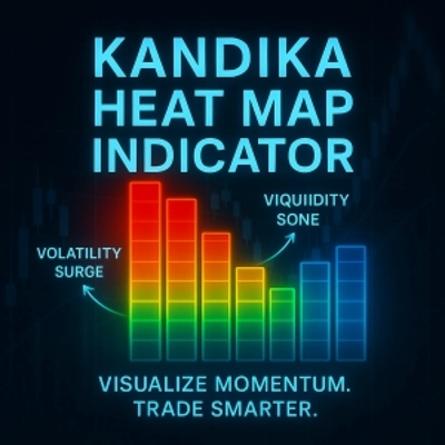
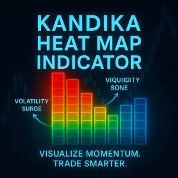
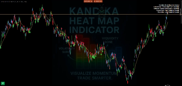
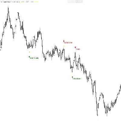
🎨 Lógica del Color – Lo Que Te Dice
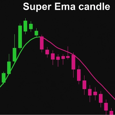
- 🟩 Verde Lima → Cambio de Tendencia al Alza
Se está formando un cambio de impulso alcista. Úsalo para captar las subidas tempranas. - 🟥 Carmesí → Cambio de Tendencia a la Baja
Señala que se está acumulando presión a la baja. Te prepara para posibles posiciones cortas o salidas. - 🟧/🔴 Naranja/Rojo → Zona de Alta Volatilidad
Espera picos de precio, movimientos rápidos y posibles trampas. No es un lugar para adivinar a ciegas—confirma tu estrategia. - 🟦 Azul Acero → Zona de Baja Volatilidad
El mercado se está desacelerando, comprimiendo o moviendo lateralmente. A menudo prepara oportunidades de ruptura.
📊 Lo Que Hace (Y Lo Que No Hace)
- ✅ Mapea claramente los cambios de dirección de la tendencia
- ✅ Separa visualmente zonas de calma vs. zonas volátiles
- ✅ Superposición simple y amigable para gráficos—sin desorden
Resumen
Resumen de IA
The Kandika Heat Map is a color-coded market indicator designed to visualize market pressure and volatility on trading charts. It uses distinct colors to represent different market conditions: lime green signals an upward trend shift indicating bullish momentum; crimson indicates a downward trend shift signaling bearish pressure; orange/red marks high volatility zones characterized by rapid price movements and potential traps; steel blue denotes low volatility zones where the market is consolidating or ranging, often preceding breakouts. This indicator clearly maps trend direction changes and visually separates calm from volatile market phases. It is presented as a simple, non-intrusive overlay that integrates smoothly with existing charts, aiding traders in identifying trend shifts and volatility levels without clutter.
Perfil del indicador
Conversación
Valoraciones de clientes
4.6
Valoraciones: 5
5 | 60 % | |
4 | 40 % | |
3 | 0 % | |
2 | 0 % | |
1 | 0 % |
Valoraciones de clientes
August 4, 2025
Good helper vibe, not a full system vibe, and A rushed entry can still spoil the trade.
August 4, 2025
No reason to yolo this live without a few normal sessions, and Bad settings can ruin the idea.
July 26, 2025
July 26, 2025
20 percent less clicking is the line to watch. Market checks feel quicker.
Preguntas frecuentes
Los productos disponibles a través de cTrader Store, incluidos bots, indicadores y plugins para operar, son proporcionados por desarrolladores de terceros y están disponibles únicamente con fines informativos y de acceso técnico. cTrader Store no es un bróker, por lo que no proporciona asesoramiento de inversión, recomendaciones personales ni ninguna garantía de rentabilidad futura.

Precio
Desde 08/06/2025
1
Ventas