
説明
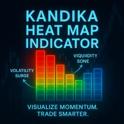
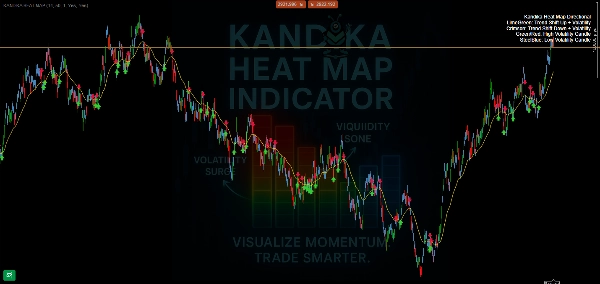
🎨 カラーロジック – それが教えてくれること
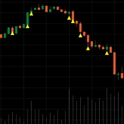
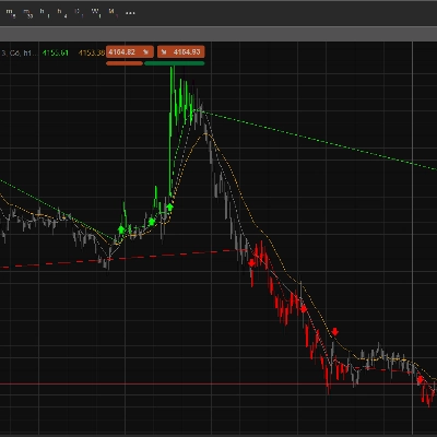
- 🟩 ライムグリーン → トレンドシフトアップ
強気のモメンタム変化が形成されています。これを利用して早期の上昇を捉えましょう。 - 🟥 クリムゾン → トレンドシフトダウン
下落圧力が高まっていることを示します。潜在的なショートや出口の準備をしましょう。 - 🟧/🔴 オレンジ/レッド → 高ボラティリティゾーン
価格の急騰、急激な動き、そして潜在的なトラップが予想されます。盲目的に推測する場所ではありません—戦略を確認してください。 - 🟦 スティールブルー → 低ボラティリティゾーン
市場は減速、圧縮、またはレンジ相場です。しばしばブレイクアウトの機会を準備します。
📊 できること(できないこと)
- ✅ トレンド方向の変化を明確に示す
- ✅ 静かなゾーンとボラティリティの高いゾーンを視覚的に区別する
- ✅ シンプルでチャートに適したオーバーレイ—煩雑さなし
概要
AIによる概要
The Kandika Heat Map is a color-coded market indicator designed to visualize market pressure and volatility on trading charts. It uses distinct colors to represent different market conditions: lime green signals an upward trend shift indicating bullish momentum; crimson indicates a downward trend shift signaling bearish pressure; orange/red marks high volatility zones characterized by rapid price movements and potential traps; steel blue denotes low volatility zones where the market is consolidating or ranging, often preceding breakouts. This indicator clearly maps trend direction changes and visually separates calm from volatile market phases. It is presented as a simple, non-intrusive overlay that integrates smoothly with existing charts, aiding traders in identifying trend shifts and volatility levels without clutter.
インジケーターのプロフィール
ディスカッション
カスタマーレビュー
4.6
レビュー: 5
5 | 60 % | |
4 | 40 % | |
3 | 0 % | |
2 | 0 % | |
1 | 0 % |
カスタマーレビュー
August 4, 2025
Good helper vibe, not a full system vibe, and A rushed entry can still spoil the trade.
August 4, 2025
No reason to yolo this live without a few normal sessions, and Bad settings can ruin the idea.
July 26, 2025
July 26, 2025
20 percent less clicking is the line to watch. Market checks feel quicker.
よくあるご質問
cTrader Storeで入手可能な取引ボット、インジケーター、プラグインなどの商品は、第三者の開発者が提供するものであり、情報と技術の取得のみを目的としてご利用いただけます。cTrader Storeはブローカーではなく、投資助言や個人的な推奨を行うことも、将来のパフォーマンスを保証することもありません。



価格
登録日 08/06/2025
1
販売