Descrição
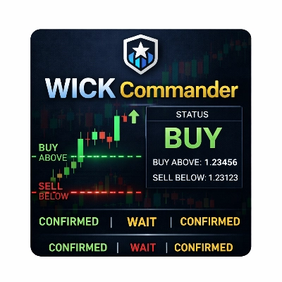
Imperium MTF Heatmap é um indicador único de alto nível para cTrader, criado para traders que querem mais do que sinais — eles querem controle do mercado, clareza visual e valor real para a negociação.
Este indicador foi projetado para revelar a verdadeira estrutura do movimento de mercado de curto prazo, combinando alinhamento multi-temporal, lógica de média móvel, força direcional e comportamento de confirmação em um sistema poderoso de heatmap.
Sua maior vantagem não é apenas o que ele mostra, mas quão rápido e claramente ele mostra. Em mercados rápidos, decisões devem ser tomadas instantaneamente. Imperium MTF Heatmap ajuda você a identificar pressão de alta e baixa, confirmar a qualidade do momentum e detectar alinhamento em camadas-chave sem poluir seu gráfico com ruído desnecessário.
As configurações padrão são especificamente otimizadas para Tick30 e Minute1, tornando este indicador excepcionalmente valioso para traders ativos que operam em ambientes rápidos e baseados em precisão. Desde o momento em que você o aplica, ele está pronto para funcionar.
Este é um indicador premium com real durabilidade.
É o tipo de ferramenta que rapidamente se torna parte da sua rotina de negociação porque fornece informações difíceis de ignorar depois que você as vê em ação.
Muitos indicadores são usados por um tempo e depois removidos.
Imperium MTF Heatmap é diferente.
Ele oferece uma vantagem visual tão prática e imediata que naturalmente se torna um daqueles indicadores aos quais você retorna todos os dias. Uma vez que está no seu gráfico e você começa a ler o mercado através dele, negociar sem ele parece perder uma camada importante de consciência.
Se você quer um indicador único, poderoso e genuinamente útil para negociação em Tick30 e Minute1, Imperium MTF Heatmap é exatamente isso.
Como Usar o Imperium MTF Heatmap
Imperium MTF Heatmap foi projetado para ajudar você a ler a direção, força e alinhamento do mercado de forma rápida e visual.
Em vez de depender de múltiplos indicadores separados, ele oferece uma visão instantânea da pressão da tendência em várias camadas.
No seu núcleo, o indicador mostra se o mercado está inclinado para alta ou baixa, quão forte é essa pressão e se as diferentes linhas estão alinhadas. Isso facilita muito identificar condições de negociação de alta qualidade e evitar configurações fracas ou ruidosas.
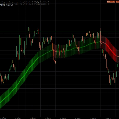
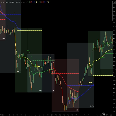
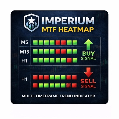
O que o heatmap mostra
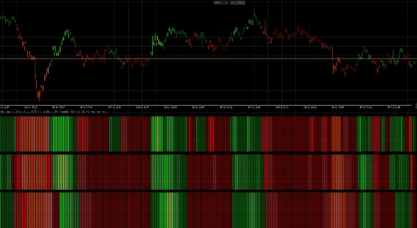
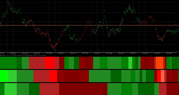
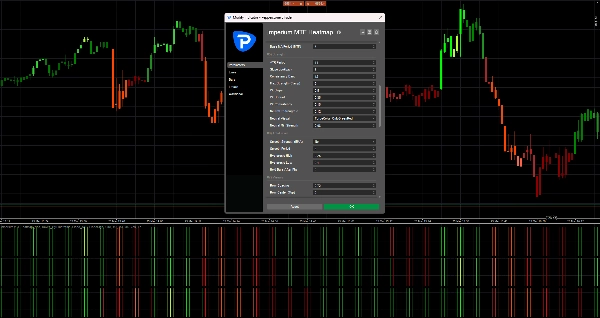
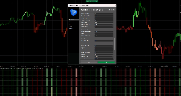
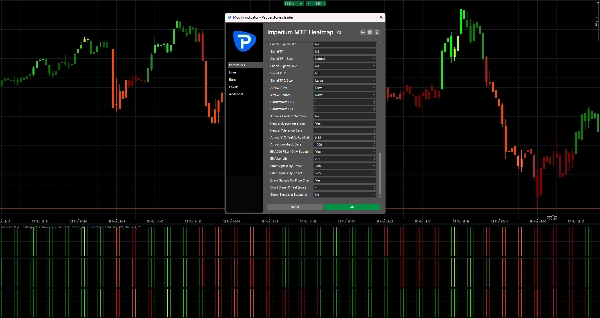
O heatmap é construído com 3 linhas, e cada linha representa um timeframe separado ou camada de média móvel dependendo do seu layout.
- Zonas verdes indicam pressão de alta
- Zonas vermelhas indicam pressão de baixa
- Intensidade de cor mais brilhante / forte significa momentum ou força da tendência mais forte
- Condições fracas ou instáveis aparecem menos poderosas e devem ser tratadas com mais cautela
Quando múltiplas linhas estão alinhadas na mesma direção, o mercado geralmente tem melhor estrutura e momentum mais limpo.
É aí que o indicador se torna especialmente valioso.
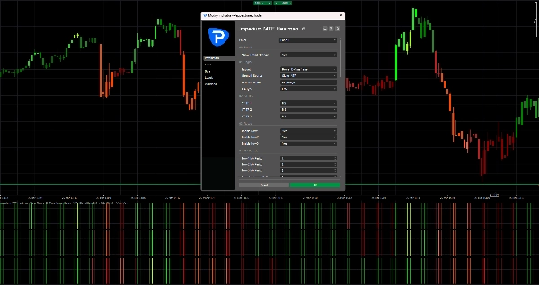
Configuração padrão
As configurações padrão são otimizadas para:
- Tick30
- Minute1
Isso significa que o indicador está pronto para uso imediato em ambientes de negociação acelerada, como scalping e trading intradiário de curto prazo.
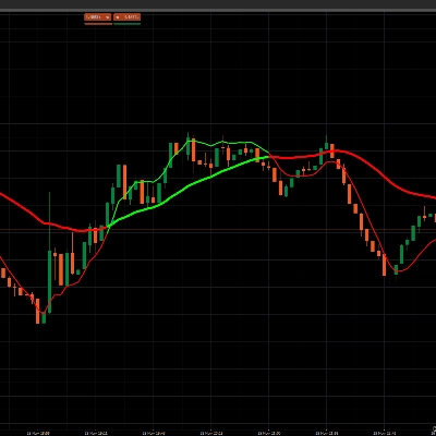
Estrutura padrão:
- Linha 1 = M2
- Linha 2 = M3
- Linha 3 = M4
Isso cria uma visão compacta multi-temporal que ajuda você a julgar rapidamente se o momentum de curto prazo é apoiado pelas camadas seguintes acima dele.
Como ler o indicador
1. Olhe primeiro para a Linha 1
A Linha 1 oferece a leitura mais rápida da direção de curto prazo e pressão imediata.
Use a Linha 1 para responder:
- O momentum está atualmente em alta ou baixa?
- Há pressão ativa no mercado agora?
- O movimento é forte ou fraco?
A Linha 1 é a primeira camada de informação, mas não deve ser sempre negociada isoladamente.
2. Use as Linhas 2 e 3 para confirmação
As Linhas 2 e 3 atuam como filtros.
Se a Linha 1 ficar verde, mas as Linhas 2 e 3 permanecerem vermelhas, o movimento pode ser fraco, precoce ou simplesmente um recuo de curta duração.
Se todas as linhas estiverem alinhadas na mesma direção, isso geralmente sinaliza uma estrutura mais forte e melhor qualidade de negociação.
Regra geral:
- 1 linha alinhada = sinal precoce
- 2 linhas alinhadas = confirmação mais forte
- 3 linhas alinhadas = confluência direcional de mais alta qualidade
Melhor forma de usar na negociação
Configuração de alta
Uma configuração de alta mais forte é quando:
- Linha 1 está verde
- Linha 2 está verde
- Linha 3 está verde
- intensidade da cor é sólida ou crescente
- ação de preço apoia a continuação
Isso indica que a pressão de alta não está isolada, mas apoiada por toda a estrutura do heatmap.
Configuração de baixa
Uma configuração de baixa mais forte é quando:
- Linha 1 está vermelha
- Linha 2 está vermelha
- Linha 3 está vermelha
- intensidade da cor é sólida ou crescente
- ação de preço apoia a continuação para baixo
Isso sugere controle de baixa e maior probabilidade para entradas curtas ou trades de continuação.
Abordagem prática para negociação
Uma maneira simples de usar o Imperium MTF Heatmap:
Estilo de entrada agressivo
Entre quando:
- Linha 1 muda fortemente
- Linha 2 começa a apoiar o movimento
- momentum se constrói rapidamente
Este estilo oferece entradas mais precoces, mas também mais risco.
Estilo de entrada conservador
Entre somente quando:
- Linha 1, Linha 2 e Linha 3 estão alinhadas
- a cor está estável e forte
- o movimento é apoiado por uma ação de preço limpa
Este estilo oferece menos entradas, mas geralmente de melhor qualidade.
Coloração das velas
O indicador também pode colorir as velas com base na direção do heatmap.
Isso ajuda você a:
- manter-se visualmente alinhado com o viés atual
- evitar negociar contra a pressão ativa
- ler o mercado mais rápido sem verificar cada linha manualmente
Com as configurações padrão, a coloração das velas está ligada a M2, que se encaixa bem com a lógica de negociação rápida dos gráficos Tick30 e Minute1.
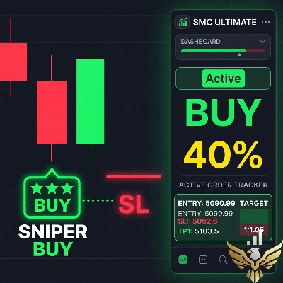
Setas de sinal
Se ativadas, as setas de sinal podem ajudar a destacar oportunidades potenciais de compra e venda.
Essas setas não são para substituir a leitura do mercado.
Funcionam melhor quando usadas junto com o alinhamento do heatmap.
Melhores práticas:
- Use as setas somente na direção do viés completo do heatmap
- Dê mais valor às setas quando as Linhas 2 e 3 confirmam a Linha 1
- Ignore as setas durante condições mistas ou conflitantes do heatmap
Nas suas configurações atuais, as setas de sinal estão desligadas off, o que mantém o gráfico limpo e foca no próprio heatmap.
O que evitar
Não use o indicador cegamente.
Evite fazer trades quando:
- as linhas estão misturadas
- as cores são fracas e instáveis
- a direção do heatmap muda rapidamente
- o mercado está volátil ou em faixa
- a ação de preço claramente discorda da estrutura do heatmap
O indicador é mais forte quando usado como uma ferramenta de suporte à decisão, não como um sistema autônomo de entrada automática.
Melhores casos de uso
Imperium MTF Heatmap é especialmente eficaz para:
- scalping
- negociação de momentum de curto prazo
- entradas de continuação de tendência
- confirmação de pullback
- análise de confluência multi-temporal
- filtragem de trades fracos
- manter alinhamento com a pressão do mercado
Por que os traders continuam usando
Este indicador se torna poderoso porque comprime muita informação importante do mercado em uma leitura visual rápida.
Uma vez que você começa a usá-lo regularmente, começa a notar:
- direção mais rápido
- força mais claramente
- alinhamento com mais confiança
- configurações fracas mais cedo
- melhor timing em mercados ativos
É por isso que frequentemente se torna um daqueles indicadores que os traders mantêm em seu gráfico o tempo todo.
Regra simples para lembrar
Alinhamento verde = procure compras
Alinhamento vermelho = procure vendas
Heatmap misto = espere
Esse princípio único já torna o indicador altamente prático.
Resumo
Traders use the heatmap to quickly assess market direction, momentum quality, and alignment across multiple layers, aiding in identifying high-quality trade setups and filtering out weak or noisy conditions. The indicator supports both aggressive and conservative entry styles based on the alignment and strength of the heatmap rows. It can also color candles according to the dominant heatmap direction for faster market reading.
Optional signal arrows highlight potential buy and sell opportunities but are intended as a supplement to heatmap analysis rather than standalone signals. Imperium MTF Heatmap is particularly suited for scalping, short-term momentum trading, trend continuation, pullback confirmation, and multi-timeframe confluence analysis across various markets including Forex, indices, commodities, stocks, and cryptocurrencies. It functions as a decision support tool to enhance market awareness and timing in active trading environments.
Avaliações de clientes
5 | 50 % | |
4 | 50 % | |
3 | 0 % | |
2 | 0 % | |
1 | 0 % |