คำอธิบาย
การคาดการณ์ราคาที่เปลี่ยนแปลงได้ 📈🔮
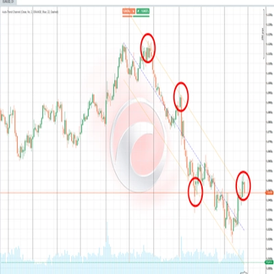
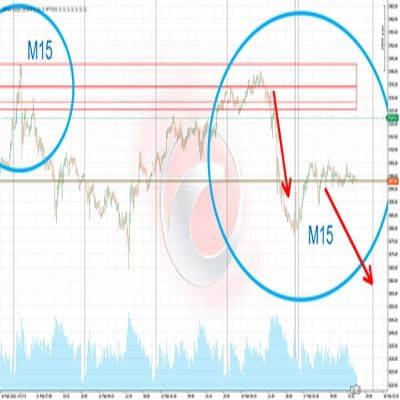
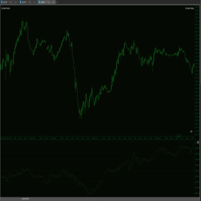
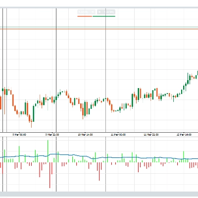
https://chartshots.spotware.com/c/69d5304ea1cc1
มันคืออะไร?
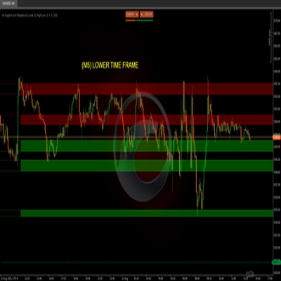
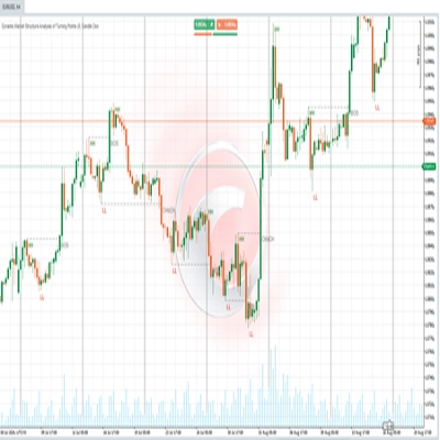
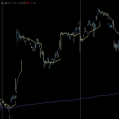
https://chartshots.spotware.com/c/69d52fb4b01cd
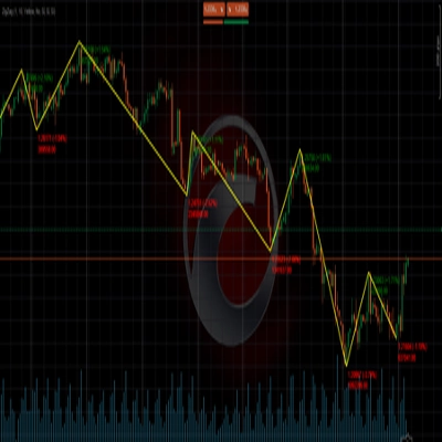
การคาดการณ์ราคาที่เปลี่ยนแปลงได้ คืออินดิเคเตอร์แบบซ้อนที่คาดการณ์ เส้นทางราคาที่น่าจะเป็นไปได้ในอนาคตทางสถิติ โดยใช้การจำลอง Monte Carlo และประเมินความโน้มเอียงทิศทางผ่าน ตัวจำแนกความน่าจะเป็นแบบเบย์เซียน มันตอบคำถามหนึ่งข้อ: โดยพิจารณาจากการเคลื่อนไหวของสินทรัพย์นี้ มันมีแนวโน้มทางสถิติที่จะไปที่ไหนต่อ? 📊
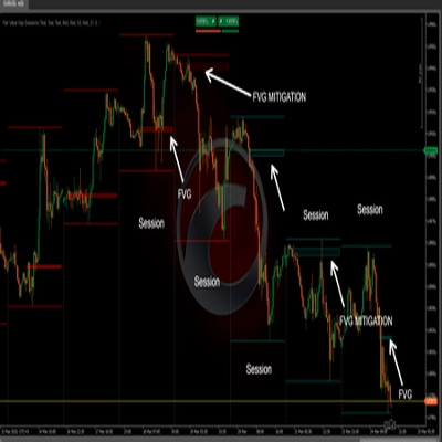
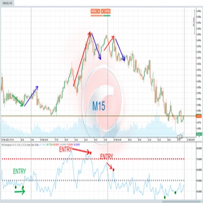
https://chartshots.spotware.com/c/69d53010d38ce
มันทำงานอย่างไร ⚙️
เครื่องยนต์ 1 — การคาดการณ์ Monte Carlo 🎲
อินดิเคเตอร์วิเคราะห์ประวัติราคาล่าสุดและสกัด ผลตอบแทนเชิงลอการิทึม มันคำนวณผลตอบแทนเฉลี่ยและส่วนเบี่ยงเบนมาตรฐาน — จับทั้ง การลอยตัว (แนวโน้ม) และ ความผันผวน (การเคลื่อนไหวที่ไม่แน่นอน) 🌪️.
มันรัน เส้นทางราคาจำลอง 200 เส้นทาง (สูงสุด 500) ไปในอนาคต การจำลองแต่ละครั้งเป็น "การเดินแบบสุ่ม" ที่อิงจากการเคลื่อนไหวจริงล่าสุด จากสิ่งเหล่านี้ อินดิเคเตอร์จะสกัด แถบเปอร์เซ็นไทล์ 5 แถบ:
แถบ
ความหมาย
95%
จุดสุดโต่งที่มองโลกในแง่ดี — มีเพียง 5% ของการจำลองที่สูงกว่า 🚀
75%
ช่วงที่น่าจะเป็นไปได้ด้านบน — ราคาสิ้นสุดเหนือระดับนี้ใน 25% ของการจำลอง 📈
50% (MD)
การคาดการณ์ค่ากลาง — ศูนย์กลางทางสถิติของผลลัพธ์ทั้งหมด 🎯
25%
ช่วงที่น่าจะเป็นไปได้ด้านล่าง — ราคาสิ้นสุดต่ำกว่าระดับนี้ใน 25% ของการจำลอง 📉
05%
จุดสุดโต่งที่มองโลกในแง่ร้าย — มีเพียง 5% ของการจำลองที่ต่ำกว่า 📉🛑
เคล็ดลับมือโปร: ยิ่งพัดลมกว้างขึ้นเท่าไหร่ ความผันผวนปัจจุบันก็ยิ่งสูงขึ้น 📢 พัดลมที่แคบหมายความว่าสินทรัพย์เคลื่อนไหวได้อย่างคาดเดาได้ 🧵.
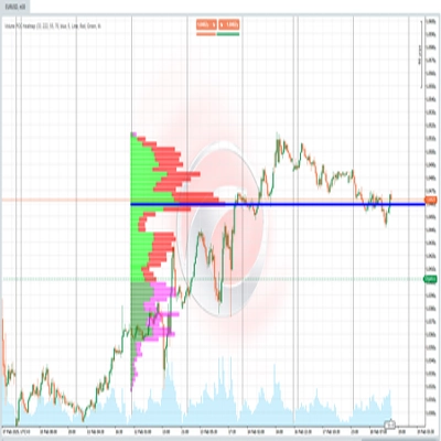
เครื่องยนต์ 2 — ตัวจำแนกแบบเบย์เซียน 🧠
แยกจากการคาดการณ์ เครื่องยนต์นี้จำแนกตลาดว่าเป็นตลาดกระทิงหรือหมีโดย:
- มองย้อนกลับไปในช่วงเวลาหนึ่ง (ค่าเริ่มต้น 500 แท่ง) 🔍.
- วัด ปริมาณสัมพัทธ์ และ โมเมนตัม สำหรับแท่งกระทิงเทียบกับแท่งหมี.
- คำนวณว่าโปรไฟล์ใดที่ แท่งปัจจุบัน เหมาะสมกว่าด้วยความน่าจะเป็นแบบเกาส์เซียน ⚖️.
ผลลัพธ์คือ เปอร์เซ็นต์ความน่าจะเป็นชนะ:
ความน่าจะเป็น
การตีความ
> 70%
ความมั่นใจในตลาดกระทิงสูง ✅🟢
50–70%
ปานกลาง / ไม่ชัดเจน ⚖️🟡
< 30%
ความมั่นใจในตลาดหมีสูง ✅🔴
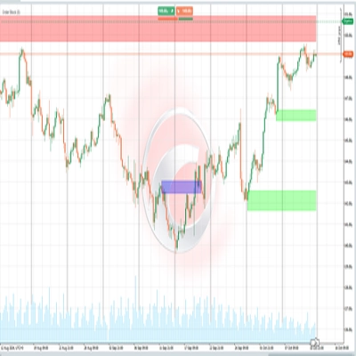
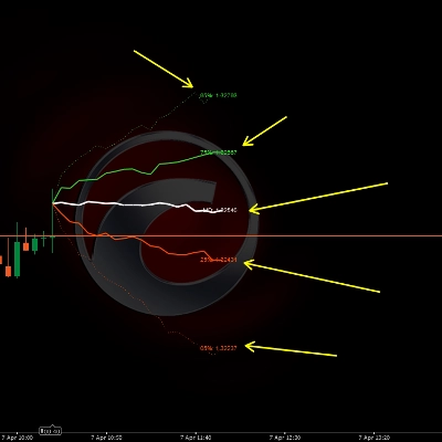
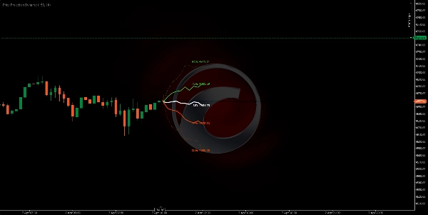
องค์ประกอบภาพ 🎨
- เส้นสีเขียว (75%, 95%): แถบการคาดการณ์ด้านบน — ช่วงตลาดกระทิง 🍏
- เส้นสีขาว (MD): ราคาที่คาดการณ์ค่ากลาง — เส้นทางที่น่าจะเป็นไปได้มากที่สุด 🏁
- เส้นสีส้ม (25%, 05%): แถบการคาดการณ์ด้านล่าง — ช่วงตลาดหมี 🍊
- เส้นประด้านนอก: จุดสุดโต่ง 95% และ 05% (ขอบเขตความน่าจะเป็นต่ำ) ⚠️
- เส้นทึบด้านใน: 75%, 50%, 25% (โซนความน่าจะเป็นสูง) ✅
- ป้ายราคา: ราคาที่คาดการณ์อย่างแม่นยำสำหรับแต่ละเปอร์เซ็นไทล์ 🏷️
- แผงข้อมูล (มุมบนขวา): ความน่าจะเป็นชนะแบบเบย์เซียน, เป้าหมายค่ากลาง, ปริมาณสัมพัทธ์, ทิศทางสัญญาณ 🖥️
วิธีใช้ 📖
- อ่านรูปร่างของพัดลม 📢 — หากมันขยายอย่างรวดเร็ว ความผันผวนจะสูงและการคาดการณ์จะไม่แน่นอนน้อยลง.
- ใช้เส้นค่ากลาง (MD) 🎯 เป็นเป้าหมายราคาที่น่าจะเป็นไปได้มากที่สุดทางสถิติในอนาคต.
- ใช้แถบ 75%/25% 📏 เป็นเป้าหมายบน/ล่างที่สมจริงสำหรับการเทรด.
- ใช้แถบ 95%/05% 🛑 เป็นขอบเขตสุดโต่ง — มีประโยชน์สำหรับการวางจุดหยุดขาดทุน.
- ตรวจสอบแผงเบย์เซียน 🧠 — ความน่าจะเป็นที่สูงกว่า 70% หรือต่ำกว่า 30% เพิ่มความมั่นใจในทิศทาง.
- รวมทั้งสองเครื่องยนต์ 🤝 — หากเส้นค่ากลางลาดขึ้น และ ความน่าจะเป็นแบบเบย์เซียน > 70% การตั้งค่านี้มีความแข็งแกร่งทางสถิติ.
พารามิเตอร์หลัก ⚙️
พารามิเตอร์
สิ่งที่ควบคุม
ค่าสูงกว่า
ค่าต่ำกว่า
จำนวนรอบ
จำนวนเส้นทางจำลอง
แถบที่เรียบขึ้น 🌊
การคำนวณที่เร็วขึ้น ⚡
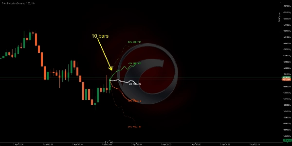
การมองไปข้างหน้า
ระยะการคาดการณ์ในอนาคต
ระยะเวลาที่ยาวขึ้น 🔭
ระยะเวลาที่สั้นกว่าและน่าเชื่อถือกว่า 🔍
ความลึกของตัวอย่าง
แท่งล่าสุดที่วิเคราะห์
พฤติกรรมระยะยาว 🐢
พฤติกรรมล่าสุดเท่านั้น 🐇
หน้าต่างตัวจำแนก
ประวัติแบบเบย์เซียน
ความน่าจะเป็นที่มั่นคงกว่า ⚖️
ตอบสนองได้มากขึ้น ⚡
โปรไฟล์อินดิเคเตอร์ 📋
- หมวดหมู่อินดิเคเตอร์: สถิติ 📊
- ประเภทผลลัพธ์: การแสดงผลและสัญญาณ 🖼️
- ความต้องการข้อมูล: แท่งเท่านั้น 📶
ข้อจำกัดความรับผิดชอบ ⚠️
อินดิเคเตอร์นี้คาดการณ์ ความน่าจะเป็นทางสถิติ ไม่ใช่การทำนาย 🔮 การจำลอง Monte Carlo สมมติว่าอนาคตจะเหมือนกับอดีตที่ผ่านมา — ซึ่งจะล้มเหลวในช่วง เหตุการณ์หงส์ดำ 🦢 หรือช่องว่างที่เกิดจากข่าว ใช้เป็นกรอบความน่าจะเป็นควบคู่กับการจัดการความเสี่ยงของคุณเอง 🛡️.
สรุป
Separately, the Bayesian classifier evaluates market sentiment by analyzing relative volume and momentum over a configurable window, providing a win probability percentage that indicates bullish or bearish confidence. Visual elements include color-coded projection bands (green for bullish, orange for bearish), a median price line, price labels for each percentile, and an info panel displaying Bayesian probability and other metrics.
Key adjustable parameters include the number of simulation iterations, projection horizon, sample depth of historical bars, and classifier window size. The indicator requires bar data with volume and outputs visual projections and directional signals. It is designed to offer a probabilistic framework for anticipating price movement based on recent market behavior, suitable for various symbols including BTCUSD, EURUSD, GBPUSD, XAUUSD, NAS100, and others.
รีวิวจากลูกค้า
5 | 0 % | |
4 | 100 % | |
3 | 0 % | |
2 | 0 % | |
1 | 0 % |