Description
Correlation Map– Your Essential Tool for Market Insights
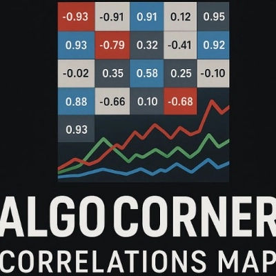
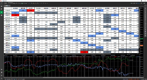
The Correlation Map is a powerful yet intuitive indicator designed to help you uncover relationships between assets at a glance. With its easy-to-read table format, you can quickly spot correlations and make more informed trading decisions.
✅ Customize Your Analysis – Select and compare as many trading pairs as your platform allows.
✅ Flexible Timeframes – Analyze correlations across any timeframe to match your strategy.
✅ Clear & Adaptable Display – Choose between decimal (-1 to 1) or percentage (-100% to 100%) formats.
✅ Smart Highlighting – Easily identify strong and weak correlations with customizable color coding.
✅ Real-Time Alerts – Stay ahead with notifications when correlation values change significantly.
✅ Interactive Data – Click any cell to track how correlations evolve over time.
✅ Ongoing Enhancements – Enjoy future updates at no extra cost.
Discover key market relationships and refine your trading strategy with the Correlation Map! 🚀
Summary
Key features include customizable display options with correlation values shown in decimal (-1 to 1) or percentage (-100% to 100%) formats, and smart color-coded highlighting to quickly identify strong or weak correlations. Users can interact with the data by clicking on any cell to track how correlations evolve over time. Real-time alerts notify users of significant changes in correlation values, aiding timely decision-making.
This tool is intended to help traders uncover relationships between assets efficiently, supporting more informed market analysis and strategy refinement.
Customer reviews
5 | 75 % | |
4 | 25 % | |
3 | 0 % | |
2 | 0 % | |
1 | 0 % |










!["High-Low Divergence [Iridio Capital]" logo](https://cdn.ctrader.com/image/webp/10a9e91b-243a-43f6-bbfe-7376bad5a214_61554)