Penerangan
🚀 Lebih 10,000 pedagang sudah menggunakan penunjuk TERBAIK kami 🏆
👉 Dapatkan semua sistem TERBAIK kami di sini:
_______________________________________________
📌 Penunjuk Struktur Pasaran
· ✅ AdvancedMarket Structure: Bos, Choch, SwinLevels, Order Blocks, Market Structure& Liquidity Finder
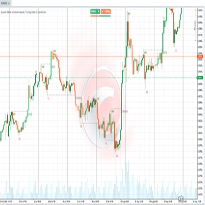
· 🔄 Dynamic Market StructureAnalysis of Turning Points
· 🧱 Order Block
· ⚖️ Market Imbalance
· ⛓️ BOS & CHOCH
· 🧠 ICT Power of 3
_______________________________________________
🔚 Sistem Keluar Pintar
_______________________________________________
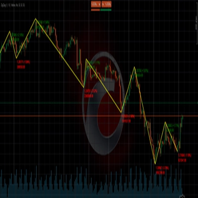
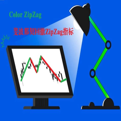
📐 Penunjuk ZigZag
· 🔍 ZigZag Price LiquidityProjection
· ➖ ZigZag
· 🎯 Penjejak Extremity Zig-Zag
_______________________________________________
🧱 Penunjuk Sokongan & Rintangan
· 🟩 Garis Sokongan & Rintangan SmartTrend
· 🧱 Semua Tahap Sokongan dan Rintangan
_______________________________________________
📊 Penunjuk Trend & Saluran
· 📊 Supertrend
· ⚡Penganalisis Trend Momentum
_______________________________________________
💧 Alat Isipadu & Kecairan
· 🔍 Jurang Nilai Adil Momentum
_______________________________________________
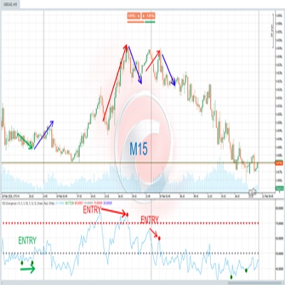
⚡ Penunjuk Momentum & RSI
· 🔎 Penjejak Bias Lilin Berbilang Tahap
Tracker
_______________________________________________
🔮 Alat Ramalan & Unjuran
· 📐 Ramalan Berdasarkan Linreg& ATR
· 📏 Regresi Linear FibonacciPelbagai jangka masa
· 📈 Pemproyektor Aliran Pasaran Berkuasa Volume
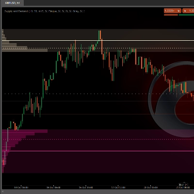
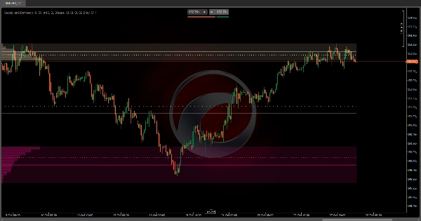
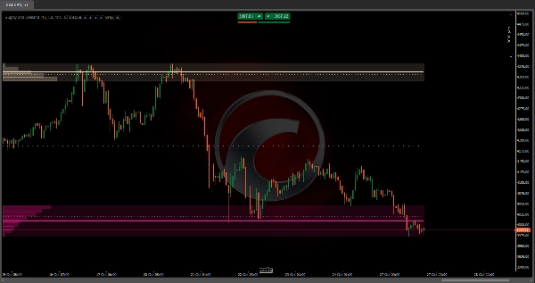
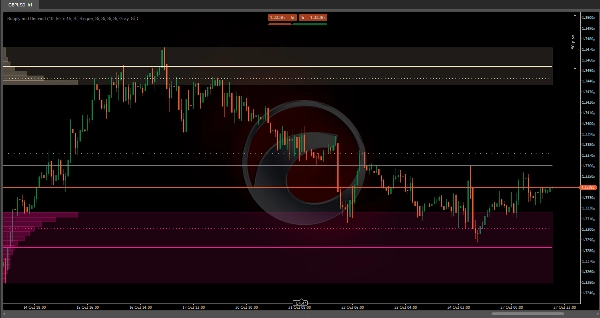
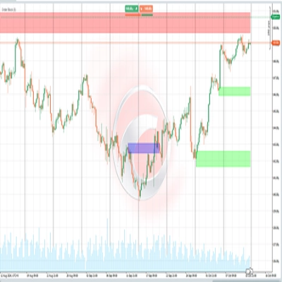
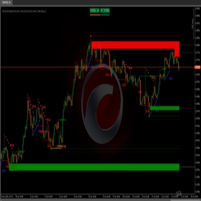
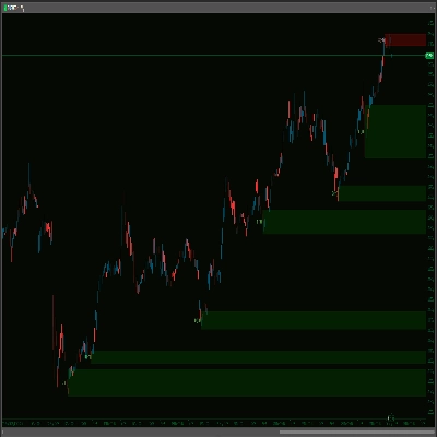
Bekalan dan Permintaan Auto: 💹
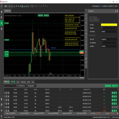
Bekalan dan Permintaan Auto adalah penunjuk analisis isipadu lanjutan yang secara automatik mengenal pasti zon aktiviti dagangan tertinggi pada carta anda. 📊 Berbeza dengan penunjuk statik lain, yang ini menyesuaikan secara dinamik dengan julat visual yang anda lihat, mengira semula zon setiap kali anda mengezum atau menatal melalui carta.
Bagaimana ia berfungsi? ❓
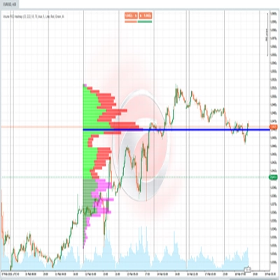
Algoritma membahagikan julat harga yang kelihatan kepada beberapa tahap mendatar (boleh dikonfigurasikan dari 2 hingga 500 bahagian) dan menganalisis isipadu yang didagangkan pada setiap tahap. Untuk mencapai ketepatan yang lebih tinggi, ia menggunakan data dari jangka masa yang lebih rendah daripada yang anda lihat. 🕒 Contohnya, jika anda melihat carta 1 jam, ia boleh menganalisis lilin 15 minit untuk mengesan dengan lebih terperinci di mana isipadu sebenarnya tertumpu.
Proses Pengenalpastian 🔍
Penunjuk berfungsi dari hujung ke tengah:
- Dari harga tertinggi: 🚀 Ia bermula pada paras tertinggi julat yang kelihatan dan menurun tahap demi tahap, mengumpul isipadu yang didagangkan dalam setiap jalur harga.
- Dari harga terendah: 📉 Serentak, ia naik dari paras rendah, mengumpul isipadu ke arah atas.
- Ambang pengaktifan: ⚡ Apabila mana-mana zon ini mengumpul peratusan tertentu daripada jumlah isipadu (boleh dikonfigurasikan, 10% secara lalai), ia ditandakan sebagai zon penting dan pencarian dalam arah itu berhenti.
- Zon tengah: ⚖️ Setelah kedua-dua zon (atas dan bawah) dikenal pasti, ruang di tengah ditandakan sebagai zon neutral atau keseimbangan.
Untuk apa ia digunakan? 🎯
Penunjuk ini adalah alat analisis struktur pasaran yang membantu anda untuk:
- Kenal pasti zon Bekalan: 🏔️ Kawasan atas di mana terdapat aktiviti jualan tinggi secara sejarah.
- Kenal pasti zon Permintaan: 🏖️ Kawasan bawah di mana aktiviti pembelian tertumpu.
- Mengesan zon Keseimbangan: 🎭 Julat tengah di mana tekanan beli dan jual seimbang.
Zon-zon ini cenderung bertindak sebagai magnet untuk harga pada masa depan, kerana ia mewakili tahap di mana ramai peserta mengambil posisi. 🧲
Bagaimana ia boleh digabungkan? 🔗
Dengan strategi tindakan harga:
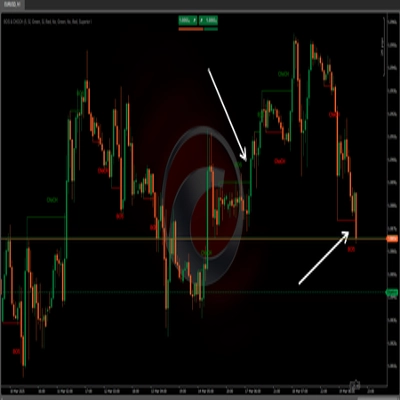
- Tunggu ujian semula zon yang dikenal pasti untuk mencari pengesahan pembalikan.
- Gunakan zon sebagai sasaran pengambilan untung atau penempatan henti rugi.
Dengan penunjuk trend:
- Dalam trend menaik, cari kemasukan apabila harga menguji semula zon permintaan bawah. 📈
- Dalam trend menurun, gunakan zon bekalan atas sebagai rintangan untuk jualan. 📉
Dengan analisis pelbagai jangka masa:
- Kenal pasti zon pada jangka masa lebih tinggi dan cari pengesahan pada jangka masa lebih rendah.
- Zon dari jangka masa lebih tinggi boleh mengandungi beberapa zon pada jangka masa lebih rendah.
Dengan penunjuk momentum:
- Gabungkan dengan RSI atau Stochastic untuk mengesahkan keadaan terlebih beli/terlebih jual dalam zon.
- Perbezaan dalam zon bekalan/permintaan boleh memberi isyarat pembalikan potensi.
Konfigurasi Boleh Disesuaikan ⚙️
Penunjuk membolehkan anda melaraskan setiap zon secara bebas sepenuhnya:
- Aktifkan/nonaktifkan setiap elemen visual (kawasan, garis purata, garis berwajaran).
- Ambang isipadu: Berapa peratus daripada jumlah isipadu mesti dikumpul untuk menganggap zon itu penting.
- Bahagian harga: Nombor lebih tinggi = ketepatan lebih tinggi tetapi lebih banyak pengiraan.
- Jangka masa lebih rendah: Menentukan ketelitian analisis isipadu.
Ciri Utama: Penyesuaian Automatik 🔄
Pengiraan semula automatik berdasarkan pandangan anda. Ini bermakna bahawa:
- Jika anda mengezum masuk untuk melihat butiran sesi, ia akan mengenal pasti zon bekalan dan permintaan khusus untuk jam-jam tersebut.
- Jika anda mengezum keluar untuk melihat minggu atau bulan, ia akan mengira semula zon makro untuk keseluruhan tempoh.
- Setiap kali anda menatal melalui carta, zon-zon dikemas kini untuk mencerminkan konteks julat yang kelihatan.
Ringkasan
The indicator divides the visible price range into configurable horizontal levels (2 to 500 divisions) and analyzes volume traded at each level using data from a lower timeframe than the chart’s timeframe for enhanced accuracy. It identifies significant zones by accumulating volume from the highest and lowest visible prices until a configurable volume threshold (default 10%) is reached, marking these as supply and demand zones respectively. The area between these zones is designated as a balance zone, representing equilibrium between buying and selling pressures.
These zones highlight areas of historically high trading activity that often act as future price magnets. The indicator supports customization of visual elements, volume thresholds, price divisions, and analysis timeframe. It can be combined with price action strategies, trend indicators, multiple timeframe analysis, and momentum indicators like RSI or Stochastic to improve trade entries, exits, and confirmations.
Supported markets include Forex, Indices, Commodities, Stocks, and Cryptocurrencies, with symbols such as EURUSD, GBPUSD, BTCUSD, XAUUSD, and NAS100.
Ulasan pelanggan
5 | 50 % | |
4 | 0 % | |
3 | 0 % | |
2 | 0 % | |
1 | 50 % |

![Logo "Gaussian Channel [Iridio Capital]"](https://cdn.ctrader.com/image/webp/7c039209-5573-4a54-a072-f9528b503103_41960)